

How to Choose Outfit Colors for Family Photos (By Season) | Bay Area Family Photography Guide
One of the most common questions families ask before a photo session is:
“What should we wear?”
And while there’s no single answer, one of the biggest factors that makes a difference is something many people overlook:
👉 the season
Light, environment, and color tones change throughout the year — and the right color combinations can make your photos feel natural, cohesive, and timeless.
For families planning family photos in San Jose and across the Bay Area, understanding how seasonal colors work can make outfit planning much easier.
Why Color Matters More Than You Think
Outfit color doesn’t just affect how you look.
It affects:
how your photos feel
how colors blend with the background
how natural the overall image appears
When colors work with the environment instead of against it, everything feels more balanced.
This is especially important in outdoor family photography sessions, where light and surroundings play a big role.
Spring: Soft, Light, and Airy
Spring is all about freshness and softness.
The environment often includes:
light greenery
soft flowers
gentle natural tones
Colors that work best:
soft pastels
light neutrals
muted pinks, creams, and sage tones
These colors blend beautifully with spring backgrounds without overpowering them.


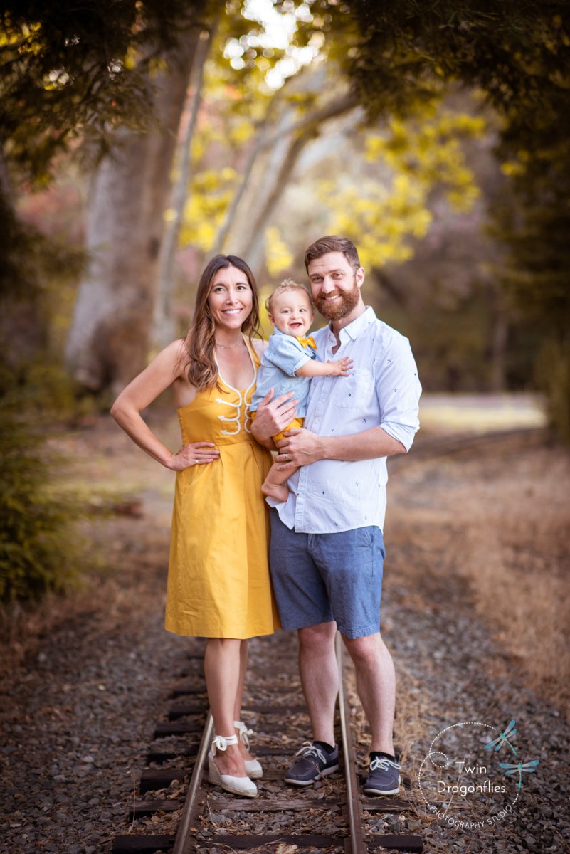


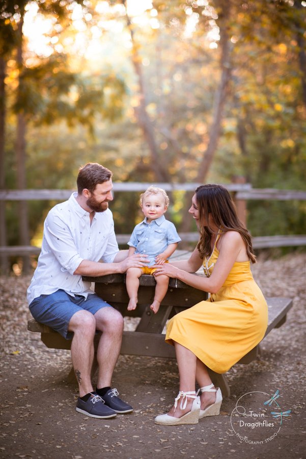

Summer: Light, Warm, and Natural
Summer light is stronger and brighter.
Outdoor sessions often include:
golden tones
dry grass
warm sunlight
Best color choices:
soft whites
beige and light tan
dusty blues
warm neutrals
Avoid overly bright or neon colors — they can reflect harshly in strong sunlight.
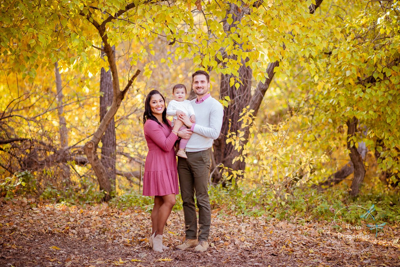
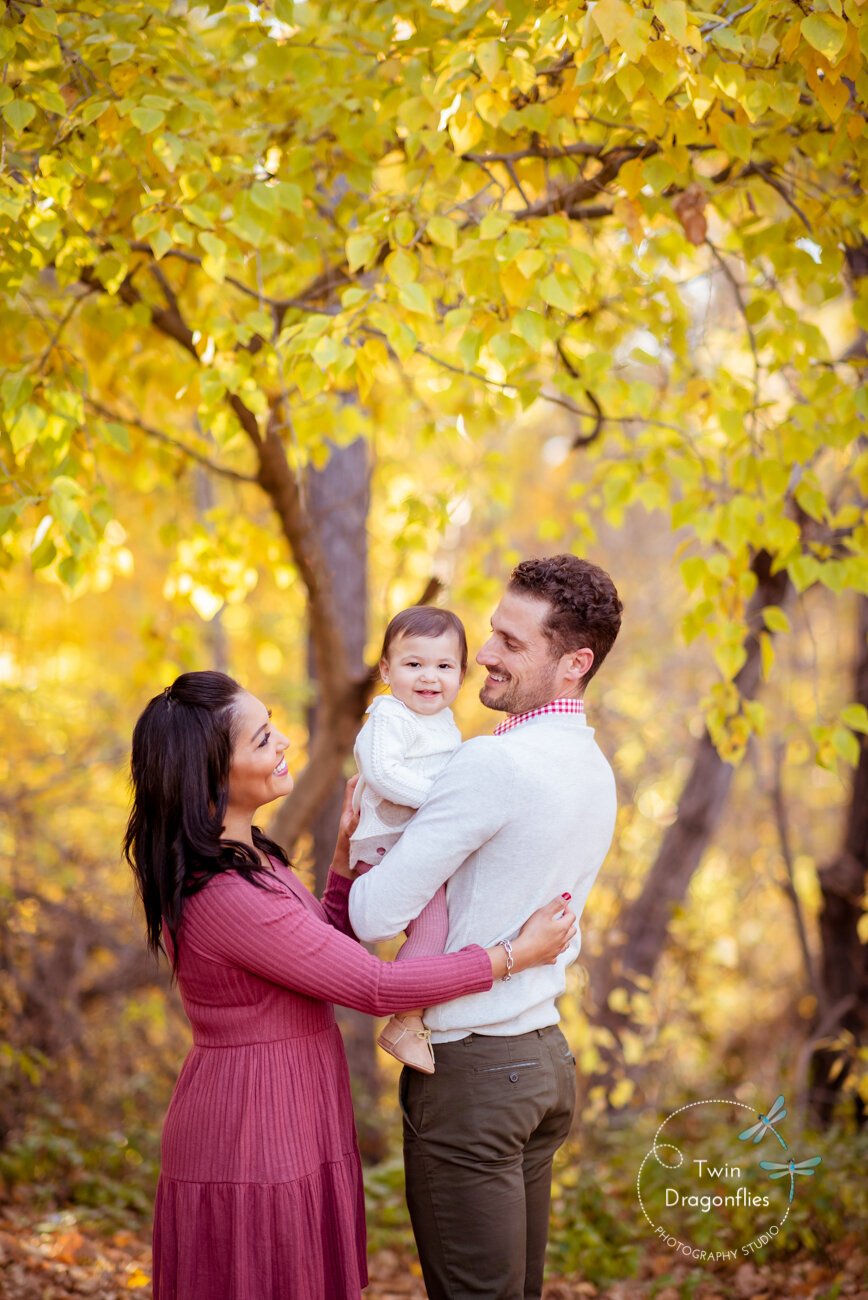
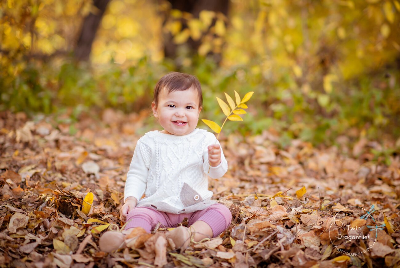
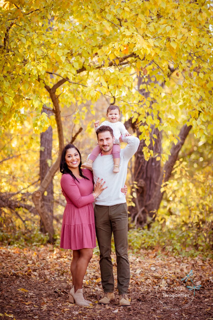
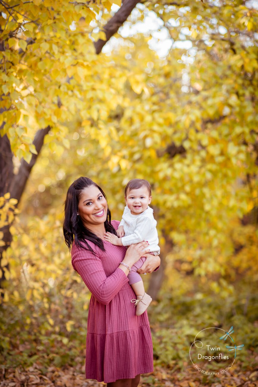
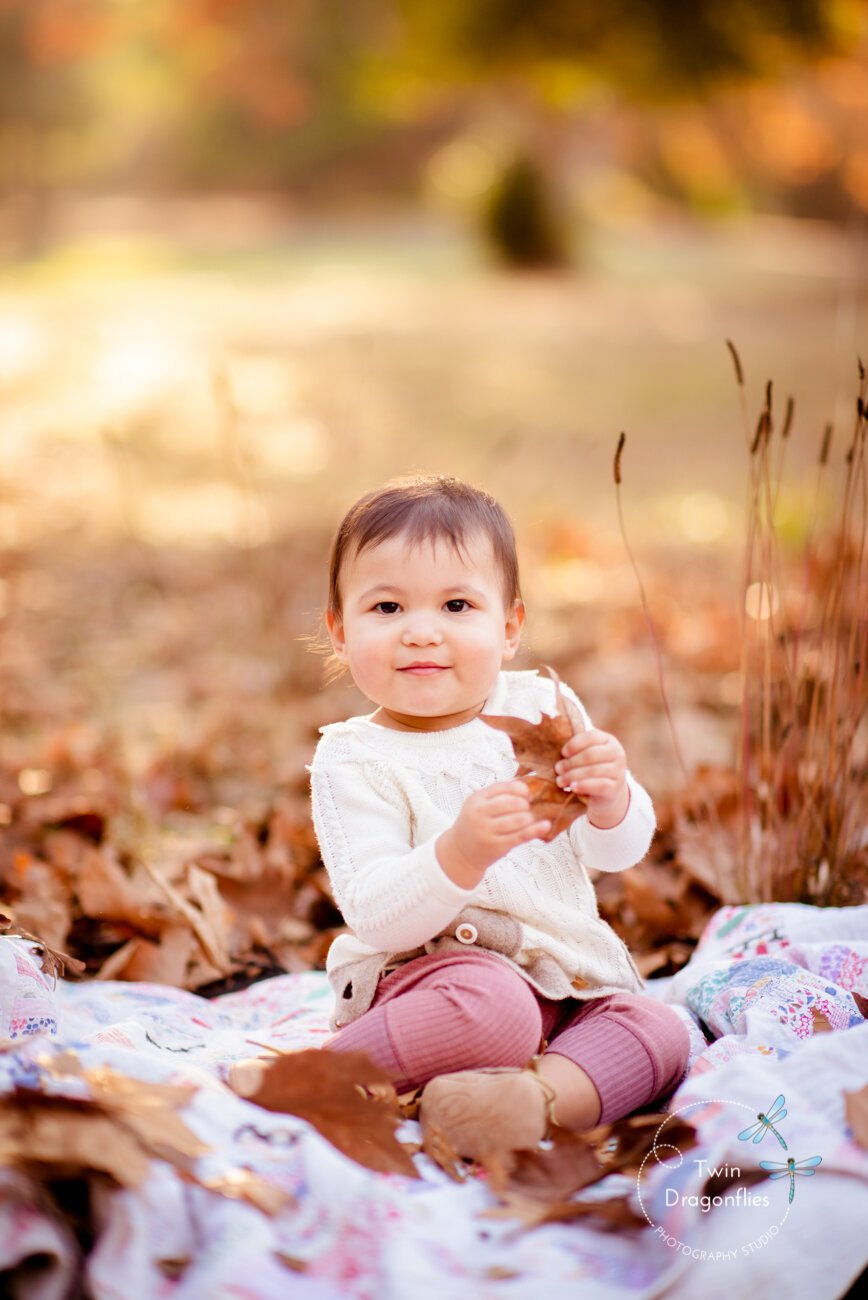
Fall: Rich, Warm, and Textured
Fall is one of the most popular seasons for family photography in the Bay Area — and for good reason.
The environment naturally includes:
warm leaves
golden tones
deeper colors
Best color palette:
earthy tones
rust, mustard, olive
deep neutrals
soft layers and textures
These tones complement fall backgrounds and create depth in your images.
Winter: Clean, Minimal, and Soft
Winter sessions often feel more minimal.
Backgrounds tend to be:
neutral
less saturated
softer overall
Best color choices:
creams and soft whites
light gray
muted earth tones
simple, minimal combinations
This creates a clean and timeless look.
Coordinating Without Matching
One of the biggest mistakes families make is trying to match exactly.
Instead, aim for:
complementary colors
similar tones
balanced variation
Think of your outfits as a palette — not identical pieces.
Why Simplicity Always Wins
Across all seasons, one thing stays consistent:
👉 simple always works best
Minimal patterns, soft textures, and neutral tones allow the focus to stay on your family — not the clothing.
This approach is often used in natural family photography sessions in San Jose and the Bay Area.
Bay Area & San Jose Family Photography
In places like San Jose and across the Bay Area, where outdoor sessions are possible year-round, choosing the right colors for the season makes a noticeable difference.
Because natural light and surroundings play such a big role, thoughtful color choices help create images that feel effortless and timeless.
Choosing what to wear doesn’t have to feel overwhelming.
When you consider the season, the environment, and how colors work together, everything becomes much easier.
And in the end, the goal isn’t to follow strict rules —
it’s to create something that feels natural, comfortable, and true to your family.
If you're planning a family photo session in San Jose or the Bay Area, you can learn more about my family sessions here.
To help your session go smoothly, here’s a guide on how to prepare for an outdoor family photo session.
Choosing the right location also matters — you can explore some of the best outdoor photo locations in the Bay Area here.